Saturday 31 December 2011

Maps, Maps and a Few More Maps.....

Apologises for being on the quiet side with regards to blogging - I hope you all had a lovely Christmas and that the revision is going well (sorry to have to remind you all!).

Considering that I haven't really written anything of great relevance this past term for AS students and A2 students also need to be able to use the geographical skills introduced at AS, I thought I would start off with going over some of the basics. Hopefully this will be of use to AS students in preparation for your skills exam, you will just have to bear with the possibly frequent references to Poole and its 'exciting' new bridge - so what better place to start then maps, especially as the map at the back of AIB looks like an invitation to construct a Choropleth map!

Maps with located symbols

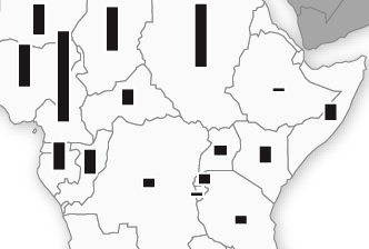
= Located proportional symbols are drawn on maps to show location and number/size of variable

- Symbols are drawn proportional in size to the size of the variable
- These maps might be used for showing the size of the biggest towns in a region. Often bars or circles are drawn to a suitable scale to illustrate comparative size, and placed upon the map to show the position of the towns, for example.
- Proportional bars are often favoured over proportional circles as they are easier to draw, read and scale. However, if the range in the data (difference between largest value and smallest value) is very big then proportional circles should be used as they offer greater efficiency in presenting large ranges. When complex data sets are used, proportional symbols can be divided (with circles, using proportionally sized pie charts).
- Used to show a limited number of points/areas and should not be used for illustrating spread of distribution

Maps showing movement

- These maps show movement by using flow lines, desire lines or trip lines

Flow lines = indicate a line of movement with its thickness representing the volume of movement and direction the line of flow
Flow lines
e.g. Flow line could be used to represent traffic flow in Poole and show where congestion becomes an issue as, as more traffic joins the route the line would get thicker and as the traffic leaves the route the flow line would get thinner.
Desire lines
Desire lines = shows strength of desire to move with lines of proportional thickness. They are very similar to flow lines except they generalise movement, showing movement only directly from A to B whilst flow lines follow the exact path of movement.
- often used to show the number of people travelling from each part of the catchment area of a central point
Trip lines = simplest map for showing movement, shows journeys from a starting point to a central point
- typically used to map school catchment areas or comparing the 'sphere of influence' of towns etc.

Maps showing distributions

- Distributions can be represented using choropleth maps, isoline maps or dot maps

Dot maps = used to represent spatial distribution where values and location are known by placing dots of equal size on a map.
- scales can be used, so one dot could represent 10 people or 100 people and a appropriate scale is chosen to ensure the map does not become too crowded
- clusters on the map will give an idea of trends in the data BUT can be tricky to read and are not very precise as dots blur  into one, therefore nothing but basic trends and anomalies can be gained from the map
- issues are also presented with where excatly to place the dots
- however, dot maps do have the advantage that they show actually numbers so actual totals can be calculated (by adding up the dots!) - something that cannot be done with choropleth maps as they represent densitites rather than totals
- limitations include the difficulty of counting large numbers of dots in order to get a precise value and the need to have a large amount of initial information before drawing the map

Isoline maps = lines that join places with an equal value for a variable, seperating places with a higher value from those with a lower value
- ideal for showing gradual spatial change as avoids abrupt changes generated by boundary lines on choropleth maps; hence why temperature, velocity and relief are mapped in this way as they are continuous , without abrupt changes at any point (like population density, for example). There are plenty of examples of isolines, like isovels (water velocity), isobars (pressure), isotherms (temperature), isohyets (rainfall) and contour lines (height) - I am sure AS students have drawn a few isovels themselves over the last term!
- when isolines are drawn close together they represent a steep gradient in the values being plotted, when they are drawn far apart they represent a gentle gradient
- isolines can never cross each other as it implies that the point where they cross has two values
- however, a large amount of data is required for accurate drawing, so in reality many points are interpolated (drawn between two known points to represent the probable point where the line being plotted moght be assumed to occur) and they are unsuitable for showing discontinuous distributions


Choropleth maps = shows spatial distributions, using shadings of different densities to represent different densitites of the variable
- darker colours indicate higher numbers, although ideally different shades of the same colour should be used
- it is good practice to avoid leaving any areas unshaded - unless they actually have no population at all
- usually desirable to show about four or five different groups - more makes map confusing and fewer does not show enough variation to be useful
- perhaps most commonly used to illustrate population density but can be used for other variables such as indicating differences in land use from recreational land or type of forest cover
- provides a good visual impression of spatial change and shows areas which have similar densities and those with very different densities; therefore allows areas to be compared and contrasted
Has its limitations though:
- suggests abrupt changes at boundaries of shaded units, which again does not really occur in reality
- choropleths, on their own, are not suitable for showing total values and so are often used in conjunction with proportional symbol overlays to solve this problem
- sometimes difficult to distinguish between the different shades
- variations within the map units are hidden, and for this reason smaller units are better than large ones

Goad map = detailed town centre plan which shows every builidng. They can be coloured coded into type of business etc to make it easier to spot land use trends
- looking at land use maps of Poole past and present may be a good idea to see how industry has developed over the years and the extent of urban sprawl etc. There are lots of maps on the A Vision of Britain Through Time website....

Well, hopefully that pretty much covers all the maps we need know about and the skills booklet (if you can find yours from last year!) has some examples of each and how to plot them etc. I think perhaps choropleths maps could come up in the A2 exam, considering we have that blank map at the back of the AIB and population densities in the table at the back, although proportional located symbols could also be an option with divided circles/bars as the table contains three housing options as percentages and various employment figures - I think I would rather a choropleth!

Hopefully, this is of some use for AS students too! I found that be able to read off, and highlight trends and anomalies, from all the maps and graphs was really important - quoting figures is crucial!!!

Next up I think I will do a review of graphical methods of presenting data, before moving on to sampling techniques and the dreaded, by many, stats tests!

Thursday 15 December 2011

Evaluating the Usefulness of Websites Regarding Poole Regeneration

Poole Borough (the website referenced in AIB) ---> This website is produced by the local council and, as such, is very useful for information relating to regeneration in Poole. Containing all the information regarding processes taking place (summarised into a timeline) and moves by the council to regenerate the area, accompanied by key documents and publications available for download, this website is probably the first place you should visit if you want to find out more about the regeneration. The website is very detailed and accurate with good archives that are easy to navigate (with a seperate section for regeneration in Poole and also the Twin Sails Bridge) through with language easily understandable for a general audience, meaning it is suitable for use by a group of A Level Geography students wishing to find out more about the Twin Sails Bridge and other elements of the regeneration. Links to websites of all the companies involved in the construction of the bridges are provided, permitting further research into how/when the bridge is being/has been built. The reliability and accessibility of this source, agruably makes it one of the best factual websites to use, however, although opinions are expressed in some of the leaflets/booklets contained within, opinions from all angles regarding the re-development are not presented, with only those supporting the bridge and re-development published. Therefore, when looking for the opinions of locals, this website is not the best one to use.

Bournemouth Echo ---> This website of a local newspaper  provides frequent updates regarding progress being made with the Twin Sails Bridge and regeneration project, as with other newspaper websites like ThisIsDorset. The website contains good archives and search facilities, therefore making it easy to navigate your way around the information. As with any sources of information, it is good practice to validate statistics provided with other sources, meaning that often it is the amalgamation of sources that proves most useful and credible, rather than one single source. One benefit of this website over that of Poole Borough Council's is its more discursive nature/style of writing that permits presentation of opinions other than those of the council, with all readers having the ability to leave comments on articles, meaning opposition to such ideas are also presenting, providing one of the best sources of public opinions on developments.  This difference between this and a national news agency such as the BBC is that public opinions are not as frequently expressed, instead focusing on the facts/statistics and illustrating what is occuring through videos. Also the only items to appear are the major 'milestones' in the regeneration process, not those just of concern for local people meaning that, again, balancing the use of both news-related sources, is the only way to gain the full picture.

New Civil Engineer ---> This is one of the websites referenced at the back of the AIB for supplying the diagrams of the bridge (page 5 of AIB), therefore, it is a sensible assumption to make that this website could be of use for an A Level student wishing to find out more about this topic. However, restrictions are placed on what a student can access as you have to be a subscriber to read the vast majority of the content, meaning most typical Geography students won't be able to access the site. This issue is not limited to just this site, with a few other sites that focus on more specific, technical detials of the bridge and regeneration also having restrictions in place, meaning gathering of information is more challenging.

Design Council ---> Provides more specific articles regarding the regeneration from architects points of view. Different to some of the other sources as provides analysis and evaluation of the project, referring it back to three key points, scale of development, quality and sustainability. Compared to other websites it is perhaps not as easy to find specific information required as the vast majority is irrelevant to this topic but it does provide an invaluable perspective from specialists rather than public opinion whilst also suggesting an alternative regeneration proposal for Poole. Websites like this, which focus more on the specific details do however start to become less accessible to a general audience as a consequence of language used.

Poole People ---> This is the website of a new political party which aims to improve the governance of this borough. From the website, it is probably clear to see that they oppose the proposals and so this website provides some of the reasons as to why people oppose the regeneration project, via video format as well as text-based explanations. It is because of this that this website could be of some use to students researching Poole regeneration plans but its usefulness beyond supplying reasons for opposition is debatable.


Tourist Information ---> With regards to finding general information about Poole and its current tourist attraction, many of the tourist information-based websites, are not that useful, such as Bournemouth and Poole and Poole Tourism, as they don't provide many specifics regarding numbers of visitors etc. On the other hand they do demonstrate what already exists in Poole and the surrounding area, as well as a bit of local history. Despite this, in terms of utility for this project, they are perhaps the least useful sites to use.

Social Media ---> Increasingly used to express opinions and convey messages to people around the world. The council have created their own Facebook page for the Twin Sails Bridge to keep the public informed about developments and it is regularly updated with links to relevant articles etc. This is very accessible and used in conjunction with their website provides ongoing accurate information. There are other groups on Facebook set up by members of the public by those opposing the bridge building although, as with discusion forums (for example, this particular one expresses the opposition from the boating community to two lifting bridges), they do not seemed to be utlised that much. Their collective usefulness only extends as far as providing an insight into the opinions of local people, although they by no means represent always the general consensus.

YouTube ---> Visual analysis of the bridge can only really be gained from either visiting Poole itself or from videos and they are quite a few 'exciting' videos on YouTtube that you could watch of the bridge being built and lifting up etc. These allow opinions to be formed on whether this iconic bridge can really blend in with the surrounding natural environment and the visual impact of such a construction. Many of these videos are on afore-mentioned websites but having them all in one place is a lot easier!
Google Earth/Google Maps ---> This form of GIS is useful in that satellite images of the surrounding area can be used to help understand which areas are going to be redeveloped and comparing such areas with the location of important conservation areas. They also indicate road layout and so how builidng a bridge would help to solve issues with traffic congestion in the area. This resource is best combined with others, such as flood risk evaluations by the Environment Agency and regeneration plans outlined on Poole Borough website to provide a visual representation of information and provide greater spatial awareness of impacts. One of the biggest uses of such a resource is the guidance it provides when conducting a Risk Assessment in preparation for conducting fieldwork in an area as risks can be highlighted such as proximity to dangerous roads, suitable/safe areas for conducting a traffic survey and where is suitable for large groups of students to cross roads, for example.

Overall, websites as a whole provide one the best sources of accessible information regarding this topical and contemporary topic and whilst some are clearly more useful and reliable than others, it is the combination of the secondary data provided that proves most significant and useful, providing a means of validation and information covering all of the key research areas. 

Monday 28 November 2011

Plate Tectonics - the basics...

Seeing as we have just started vulcanicity, I thought it would be a good time for me to re-cap on what we should have learnt so far (we have covered quite a lot of new stuff, especially for non-Geologists such as myself, so this will probably have to be written over a series of posts)......

First up, we need to have a basic understanding of the evidence that exists which supports the theory of plate tectonics. As simply as it can be put, we have older evidence and newer evidence.

Older Evidence:
- Biology - same fossil formations found in different parts of the world
- Geology - rocks of same afe and type and displaying the same formations found across the globe. Similar glacial deposits are found in Antarctica, South America and India, now many thousands of kilometres apart; striations showing the same orientation when the continents are reunited, are found in Brazil and West Africa.
- Climate - fossils of plants that live in tropical conditions found in Antarctica, with it incredibly unlikely that tropical climatic conditions ever existed in Antarctica's current location. PLaces apart across the globe contain coal deposits of similar age that were formed in tropical conditions; they are no longer in tropical climatic belts therefore must have drifted apart since the Carboniferous period.

New Evidence:
- Discovery of the Mid-Atlantic Ridge (1948)
- Paleomagnetism and the reversal of the Earths magnetic field (1950s)
- Seafloor spreading and then carbon dating of the seafloor rocks (1960s)
After passing the Curie Point, iron ions within the lava will
align to magnetic north......
.....This means that as the seafloor has spread, and magnetic reversal has occured in
the past, stripes are visible on the seafloor, preserving a record of the Earth's polarity at the time
of the lava cooling. This has helped to support the idea of seafloor spreading as the youngest
 rock is located nearest to the ridge.

Hopefully, this timeline summarises the key dates and discoveries we need to know about!


Structure of the Earth:

1. Crust :- it is the upper layer which is solid and is divided into 2 types;
       - Oceanic crust = mainly basaltic in nature and around 6-10km thick. It is more dense and younger than continental curst
       - Continental crust = composed of a wide variety of igneous, metamorphic and sedimentary rock. Can be as much as 70km thick.

2. Moho Discontinuity :- boundary between the crust and the mantle. Average depth of 8km below oceanic crust and 32 km below continental crust. Has density similar tp an olivine-rich rock such as peridotite and so is less dense than the mantle; as such seismic waves accelerate in this region.

3. Mantle :- below the crust. Upper part is solid and is part of the lithosphere. Below this is the asthenosphere which is partly molten and can flow, whilst the rest of the mantle is liquid.
       - Lithosphere = consists of the outer solid part of the Earth, which includse the crust and rigid upper mantle. The lithosphere is about 100km thick, although thickness is age dependent (oldest=thickest). Lithosphere below the crust is brittle enough at some locations to produce earthquakes by faulting, such as within subducted oceanic plate.
      - Asthenosphere = ductile part of the Earth just below the lithosphere, including the lower mantle. It is about 180mk thick. Relatively slow seismic movements compared to the lithosphere.

4. Gutenburg Discontinuity :- boundary between the outer core and the mantle. Where thermal nuclear reactions occur that start convection cells off in the mantle, sending plutons of hot magma upwards. Located at a depth of about 2,800km and marks a sudden increase in density.

5. Outer Core :- liquid iron-nickel alloy, temperatures of over 6000C.

6. Inner Core : - Solid iron-nickel alloy. Even though temperature is higher than the outer core, the pressure produced by overlying weight is strong enough to prevent the liquid state.

How do we know this? Well, studies of earthquake waves, with regards to the velocities and paths of such waves,  depends on what excatly it is they are passing through. P waves can travel through anything but S waves can only pass through solids; so by studying these waves it has been possible for scientists to determine the physical composition of the Earth's interior.

Convection Currents = Driving Force

- Occur in the mantle, very slow convection currents flow in the asthenosphere
- Provide horizontal forces on the plates of the lithosphere, with high temperatures causing updoming and tensional forces pulling the crust apart
- Start in the Gutenburg Discontinuity where thermal nuclear reactions send a pluton upwards

Boundary Types

The Earth's lithosphere is split up into 7 major plates, and around 14 minor ones, with some plates composed of both oceanic and continental crust. Between these plates are boundaries/margins, and there are three main types.......
----- I am going to do a seperate post for each boundary type but, in short:-

- Divergent (constructive) = Plates move away from each other, generating tensional forces. Consequently, characterised by shallow-focus earthquakes and volcanoes producing basaltic magma, forming new oceanic crust. Produces oceanic ridges and rift valleys.

- Convergent (destructive) = Plates move towards one another, generating compressional environments, therefore are characterised by deformation, volcanism, mountain building, seismicity and mineral deposits. Three possible types:-
                                                                - Oceanic vs Oceanic
                                                                - Oceanic vs Continental
                                                                - Continental vs Continental
- Conservative = Plates move laterally past each other, or in the same direction at different speeds. Produces a lot of shear stress as lithosphere is neither destroyed or created. No volcanic activity but lots of shallow-focus earthquakes, intensely shattered rock and characterised by production of faults parallel to plate movement.

Wednesday 16 November 2011

The Revenge of Gaia - A student's book review

I really need to get into the habitat of reading a book and then writing the book review, not waiting a few months before I do so - however, seeing as I read this book in the summer holidays, it will be a good test of how much I can remember!

This book is another one of James Lovelock's and you really need to have read the first one, if you are to make any sense of this book. The first book 'Gaia' explains the idea of the Gaia theory and how it was created. So, just for a quick reminder, the Gaia theory, in its simplest form, suggests that the physical and chemical conditions of the surface of the Earth, of the atmosphere, and of the oceans has been and is actively made fit and comfortable by the presence of life itself; whilst also encompassing the belief that life does not regulate or make the Earth comfortable for itself. Instead, regulation, at a state fit for life, is a property of the whole evolving system of life, air, ocean, and rocks and with a mathematical basis in the model Daisyworld which generates testable predictions. Basically, the Earth is kind of alive as one big organism and self-regulates - I will warn you again, read these books with quite an open mind and when you have the time to really think about and process the ideas the author is trying to present; it was a totally new, but intriguing, idea for me and I think I am still trying to totally get me head around it! Perhaps its no suprise that when this theory was first published it was viewed with great suspiscion and skepitism, but it seems to be becoming  more widely accepted within the scientific community.

This time, instead of presenting and trying to prove the Gaia hypothesis, Lovelock applies it to global climate change, although he seems to prefer the use of global heating, which he thinks to some extent is unavoidable as a consequence of current levels of anthropogenic forcing and will abruptly occur. Throughout the book it is incredibly clear that he feels anthropogenic forcing is solely responsible for current and impending climatic alterations and that our actions have and prevail to destabilise the Earth and, as the title implies, in revenege Earth is readjusting and consequently generating less habitable conditions for us. Lovelock is definetly not afraid of presenting his ideas and views (for example, he clearly states his view that global climate change is irreversible, something which was not necessarily recieved so well by those trying to persuade people to lead more 'green' lifestyles!) in an attempt to alter the way we think and whilst I find it hard to accept everything he says, it is, again, an incredibly thought provoking book.

There are a couple ideas/views that Lovelock mentioned which have really stuck in my mind. As also touched upon in his first book, within The Revenge of Gaia he clearly emphasises his support for nuclear power, viewing it as an efficient and less environmentally damaging energy resource than those currently exploited (i.e oil and coal!). Nuclear power is always going to be a controversial issue, perhaps more so after events in Japan earlier this year, and so I wonder if Lovelock's view of nuclear power has changed in anyway since he wrote this book. It is a resource that could be exploited, but like all sources of energy it has its disadvantages and risks which cannot be ignored and also, it cannot solve the issue of removing the global dependency on oil. Many of his ideas almost seem to go against the more conventional way of thinking, i.e we should use appropriate technology (normally very low-tech) to enable sustainable development so that society can not only reduce anthropogenic forcing and sustain existance but also adapt to coming changes. Lovelock seems to feel that we need a more high-tech approach but not in an attempt to solve the coming 'climate crisis', as he feels we have already lost the oppurtunity to implement sustainable development, instead to enable mankind to perform a sustainable retreat from our current level of control and detrimental influence we have over Earth. This high-tech approach is the only way he feels that we can feed the world's population which is probably true. I fail to see how organic farming can remain an efficient and viable option in the future and with issues with energy supplies and future climatic alterations, traditional agricultural practices are going to become increasingly challenging to entertain. Feeding the global population is a common worry shared by many, including Lovelock, who suggested that Britain could be one of a very few countries (so long as we implemented tight rules on immigration) who could revert back to being self-sufficient and sustain its population in the future without import reliance. However, Lovelock's suggestion of who we could achieve this is interesting to say the least.............. he suggested that we took Scotland, England and Wales and reserved one for living space, one for food and left the remainder of the Britain as a Gaia friendly region. If this was every suggested in parliament I would be intrigued to see how they would decided which areas to have as which of these three key regions - could be an interested discussion! Would it work? Well, I cannot see any such decision being recieved well enough for such a scheme to work unless it was absolutely necessary so lets just hope it doesn't come to this! So what does he feel is the root cause of this environmental problem? Well, you can probably guess and most of you will agree - population growth. He thinks its quite simple, there are too many of us who live unsustainable lifestyles. If there was only about 1 billion of us on the planet then we could probably live whatever way we wanted to and have no lasting impact but there are 7 billion of us and so we simply cannot. Again, his answer is a 'sustainable retreat' from the detrimental control and influence we excercise over Gaia and if we fail to do so he warns we will experience "a global decline into a chaotic world ruled by brutal warlords on a devastated Earth" and practically on this note the book ends; unfortunately the idea of a 'chaotic world ruled by brutal warlords on a devasted Earth' could become a reality in the future as, currently we are prepared to fight over unessential resources i.e oil, so what will we be prepared to dp when we are fighting over items needed for survival, principally water and food? If you ask me, that is a slightly worrying thought and I don't feel very optimistic about the answer.......

Like my conclusion for the review of Gaia, its really hard to know what to say about this book but if you have the time, I would try and read it. For many of you, as with me, it will be a totally new way of thinking and perspective on life, consequently making it a very thought provoking book. I do wonder how Lovelock comes up with such ideas. I cannot deny that it does intrigue me and is a very different way of thinking, consequently I feel there is only so much my brain can cope with reading about it at one time. I quite like the way he links feedbacks together to try and prove his point but I think perhaps some of it has been slightly over thought and, perhaps because I am personally better at dealing with the tangible, I kind of feel like there is an element of reluctancy to test his theory - although I am not 100% sure how you could test this hypothesis! You cannot deny that many things are interlinked but the idea that Earth is sort of like an omniscient, omnipotent superorganism that self-regulates in an almost indentical way to the bodies process of homeostatis, and then in an act of revenge against anthropogenic activity, readjusts to make life difficult for humanity, is a leap am I struggling to make and accept in my mind.

Anyway, if you get around to reading it, let me know what you think! The ideas are hard to process and I found the easiest way to do so was to discuss it......

Wednesday 9 November 2011

All those 'lovely' development acronyms............

Okay, so I realise that my blogging record since we started back in September has been appalling but I am going to try and sort that out so that I start writing regular and (hopefully!) useful blog posts again. My plan for the next few weeks is to write all the book reviews of the books I have been reading over the last half term, write a couple posts on current issues/discursive topics relevant to the Development and Globalisation module we have just finished, write a summary sort of revision post on everything we have covered so far (with special emphasise on the areas that people have asked me to write posts on) and then make a start on our exciting new module - Plate Tectonics and Associated Hazards! So where to start? Well, after my classes appalling performance in the quiz on Monday, I thought a post on all the development acronyms was desperately required. There are quite a few to remember so let me know if I miss any off this list!

Classification of Countries
LDC = Less Developed Country
e.g Sierra Leone, Haiti, Myanmar
- 33 out of the 50 LDC's are sub-Saharan
- highest HDI ranking of LDC is Gabon at 119th and then South Africa at 121st (out of 197)
What makes an LDC?
1. Income below $750 per capita per year
2. Weak human resources
     - Health
     - Education
     - Nutrition and calorie uptake
3. Economic vulnerability
     - Instability of exports
     - Instability of agricultural production

MDC = More Developed Country
e.g USA, UK, Norway

NIC = Newly Industralised Country (more than last 40 years)
e.g South Korea, Hong Kong

RIC = Recently Industralised Country (last 40 years)
e.g Brazil, Russia

ORC = Oil-Rich Countries
e.g Qatar, Saudi Arabia

LLDC = Land-Locked Less Developed Country
e.g Central African Republic, Bhutan, Moldova, Bolivia
SIDS = Small Island Developing States
e.g Vanuata, Dominican Republic, Seychelles
HIPC = Heavily Indebted Poor Countries
e.g Rwanda, Ghana, Afghanistan
- 29 out of the 40 HIPC's in the world are sub-Saharan

Development Indicators
HDI = Human Development Index
= Compoisite indicator first used by the UN in 1990 to replace the sole use of GDP
Takes into account:-
   - GNI PPP per capita
   - Years of schooling
   - Life expectancy at birth
End figure is between 0 and 1, with proximity to 1 indicating development of a country
e.g 1st = Norway 0.943, 28th = UK 0.863, 84th = Brazil 0.718, 101st = China 0.687, 134th = India 0.547, 187th = DR Congo 0.286 - it is worth checking out an updated list as this years results were released by the UN last week

HPI = Happy Planet Index
- Introduced by the New Economics Foundation (NEF) in 2006
- Doesn't indicate which is the happiest country in the world but the relative ecological efficiency with which human well-being is delivered around the world
- First index to combine environmental efficiency with human well-being
- However it is based mainly on opinions not facts and so is subjective
e.g 1st = Costa Rica, 2nd = Dominican Republic, 3rd = Jamaica, 20th = China, 74th = UK

PQLI = Physical Quality of Life Index
- Developed in the 1970s due to dissatisifaction with the use of GDP
Takes into account:-
   - Literacy Rates
   - Infant Mortality
   - Life expectancy at age 1
- Criticised as there is considerable overlap between IMR and LE

GDP = Gross Domestic Product
= the total calue of goods and services within a country (including foreign companies)
What are the issues with using GDp per capita as a measure of development?
1. Inequalities: - In many LDCs the wealth remains with a few people with control over the government and industry so does not filter down through the population
2. Informal Employment : - In LDCs many people work in the informal business sector, such as street vending, and so money is exchanged without record and, therefore, does not appear during GDP calculations
3. Subsistence Lifestyles: - Many farmers lead a subsistence lifestyle and so it is impossible to accurately measure income and population

GNP = Gross National Product
= the total value of goods and services for a country's companies at home and abroad

GNI = Gross National Income
= GDP plus or minus the interest and repayments on debt

PPP = Purchasing Power Parity
= essentially a measure of the value of the local currency (basically how much can be brought in a country with a set amount of money)

International Groupings
EU = European Union
- 1957 Treaty of Rome created the European Economic Community (EEC) which had 6 members (France, Italy, West Germany, Belgium, Netherlands and Luxemburg). Slowly more and more countries have joined and there are now 27

AU = African Union
- Founded in 2002 to succeed the Organisation of African Unity (OAU)
- Includes all African nations apart from Morocco who left the OAU in 1984 and Madagascar who were suspended in 2009
Aims to: -
   - Accelerate political and socio-economic integration of the continet
   - Promote democracy and human rights
   - Achieve continental peace
   - Promote and defend Africa's voice in world affairs

NAFTA = North American Free Trade Agreement
- Founded in 1994 to create a free trade zone, encourage investment in each other and promote competition
- Grouping consists of USA, Canada and Mexico

NATO = North Atlantic Treaty Organisation
- Founded in 1949, with 28 members, and is classed as an intergovernmental military alliance
- Accounts for 70% of the world's defence spending

OPEC = Organisation of Petroleum Exporting Countries
- Founded in 1961 and consists of 12 countries all of which are net exporters of oil. They are responsible for setting the global oil prices

OECD = Organisation of Economic Cooperation and Development
- Founded in 1961 to replace the Organisation of European Economic Cooperation (OEEC) which was founded in 1948
- Includes 34 countries and aims to stimulate economic progress and world trade

AOSIS = Alliance of Small Islands States
- Established in 1990 with 42 countries to consolidate the voices of SIDS to address global climate change

UN = United Nations
- Founded in 1945 and has 193 members
- Aims to promote and provide international law and security, economic development, social progression, human rights and world peace

APEC = Asia-Pacific Economic Cooperation
- 21 members bordering the Pacific Ocean all pledging free trade

G-8 = Group of 8
- Group of the worlds major economies. Founded in 1975 with France, Canada, Germany, Italy, Japan, UK and USA. Russia was then added to make it the G-8 in 1997.

G-20 = Group of 20
- The G20 was established in 1999, in the wake of the 1997 Asian Financial Crisis, to bring together major advanced and emerging economies to stabilize the global financial market.


G-77 = Group of 77
- Currently 130 members who are all LDCs, constituting the largest intergovernmental organisation of developing states in the UN, providing LDCs with a greater voice. China has always been an very close ally of this group but is not an offical member.

BRIC = Brazil, Russia, India, China / BRICM = BRIC + Mexico
- The world's emerging markets
- Why do the BRIC's matter?

All the others which I can't think of a catergory for

MDG = Millenium Development Goal
- Eight development goals that 23 internation organisations and all 193 UN members agreed to aim to achieve by 2015

TNC = Transnational Coporations  MNC = Multinational Coporations
- Corporation that has production establishments or delivers services in at least two countries. Some TNCs have grown so large that they have budgets that exceed those of many countries in which they operate

FDI = Foreign Direct Investment

CPC = Communist Party of China

SEZ = Special Economic Zone
e.g Many set up in China, for example, like Bejing to act as growth poles and all development to spread

SAR = Special Adminstrive Regions
e.g Hong Kong

GATT = General Agreement on Tariffs and Trade
- Formed in 1947 during the UN Conference on Trade and Employment but only lasted until 1994 when it was replaced by WTO

WTO = World Trade Organisation
- Replaced GATT and aims to gradually lower barriers to international trade. Liberalising organisation created by capitalist economies

IMF = International Monetary Fund
- Founded in 1945 with 29 members but has since grown to 187
- Promotes international economic cooperation

DfID = Department for International Development
- UK government department that seperated from the Foreign and Commonwealth Office in 1997
- Aims to promote sustainable development and eridicate world poverty

NEF = New Economics Foundation

UNESCO = United Nations Education, Scientific and Cultural Organisation

ERDF = European Regional Development Fund
- Aims to strengthen economic and social cohesion in the EU by correcting imbalances between its regions

ISO = International Organisation for Standardization
- Ensures the standardization of containerization across the globe

NGO = Non-Governmental Organisation

I don't think I really appreciated just how many there were until I started writing them down! Hope this helps - let me know if I missed any of the list....


Monday 31 October 2011

Global population = 7 Billion

UN predictions suggest that today the world's population reaches a staggering 7 billion and I have to admit that it is pretty cool, although slightly scary, to think that I share my birthday with the 7 billionth inhabitant of Earth -  quite fitting considering it is Halloween!

The graph above illustrates where I fit into the picture - 5,582,734,706th person when I was born, making me the 80,819,731,395th person ever alive on Planet Earth - follow the link to find out which 1 of 7 billion you are....

I realise you are not going to be short of things to read on this topic over the coming weeks so I am not going to delve to much into the details of this pretty historic moment but first up for a few statistics that I am sure we could all slip into a Geography essay (or two!) over the common year...

Globally, every hour there are:
- 15,347 births
- 6, 418 deaths
= Average yearly increase of +1.162%
Fast-growing country is Qatar at +514 people per day
Fast-shrinking country is Moldova at -106 people per day

Highest life expectancy is in Japan at 82.7 years
Lowest life expectancy is in the Central African Republic at 45.9 years

97/100 new people on the planet are currently being born in developing countries

In the UK, the population is around 62156764 and every hour there are:
- 85 births
- 66 deaths
- +23 immigrants
= Average yearly growth of 0.6%
Average life expectancy is 79.6 years (81.7 for females and 77.4 for males)

It is quite hard to visualise all these statistics regarding population expansion but this interactive graphic produced by the Guardian, based on the UN projections, is quite good, especially when aiming to make comparisons between countries. Whilst talking about the Guardian and the resources they offer, they are very good at reporting on development and environmental issues and so checking up on that ever so often would be a good way to keep up with your independent reading, or if you are likely to forget to check you can like the facebook pages for both. However, if the thought of reading lots doesn't really excite you much then they also produce podcasts which are not too long and quite interesting to listen to - I find some of them quite good for helping me form opinions on this human geography stuff - here is the link to a recent podcast on population growth.

Whats next? Will people numbers stop rising?
The global population is expected to continue to increase during the course of this century, reaching 10 billion by 2083 - follow the link above to see a clip that illustrates this quite well. However, the rate of this growth is expected to slow in comparison to the rapid rate of exapnsion witness over the last 100 years. Little of this growth is happening in countries such as the UK, who are expected over coming years to see a drastic reduction in growth with many possibly experiencing negative growth. Instead, the growth is occuring in the developing world - with Asia presently experiencing most growth although this is soon likely to switch to Africa. We have recently placed quite a bit of focus on to the issues of ageing populations and so it is easy to forget that the world's population is actually quite young, with 43% under 25 (this constitutes 60% of the population across developing countries).

I have been struggling to know what excatly to write but the idea of writing a letter to the 7 billionth person caught my eye so I thought I would give it a try.......

Dear 7 billionth person,

First up, welcome to the world! We havent really been looking after Earth that well and unless we start to change our attitude then the future does not really look that bright......

I am trying really hard not to start on a negative but I have to admit its not easy. 7 billion people on the planet - I doubt if you said that 50 years ago anyone would have believed you, especially in the given timescale. 1 billion people added to the planet in 12 years is crazy and worryingly, for a while atleast, the rate of population expansion could continue to accelerate before it begins to slow down - I would love to know what Thomas Malthus would think about this all if he was still alive today. Anyway, whilst its easy to focus on all the doom and gloom that the future may hold, I think that this historic moment in time warrants us all to sit back and reflect, reflect on the progress made my mankind over the past few centuries. As a race we have come so far and the fact that I can stand here today and say that the global population has reached 7 billion is real testament to the great thinkers of  past generations who have solved so many of the problems society has face. Yes, we have made some huge mistakes in the past, and prevail to do so, but enough of us have learnt from this to allow for progress to be made. If you are born into a developed country (although this is unlikely considering 97/100 babies are born in developing countries) you will have access to all the simply remarkable scientific discoveries and technological advancements that have been made and therefore we be able to experience the best that we have so far achieved. If you are fortunate enough to be granted this luxury, please don't be ignorant to the fact, like so many, that the world is full of inequality, poverty is rife and suffering is an unnerving norm for so many. Suffering extends to the environment we inhabit and there is no hiding the fact our current status has been built on unsustainable foundations whilst we continually threaten our world in an unacceptable and, possibly, unforgivable way.....

Perhaps, its good that the UN have decided not to name the 7 billionth inhabitant of Earth as I feel a lot of responsiblilty would have been placed on you. Instead I think the number and the idea itself that there are 7 billion people on planet Earth should be enough (hopefully!) to shock people into changing - if we don't change (and soon!) then the thousands of children born each day are only going to inherit problems, problems generated by our ignorance and arrogance. Unification is what is required as we all need to act together if our efforts are to have the desired effect. Of course, politcans and public figures leading the way will help but we need to want to change for ourselves and the good of mankind. Hopefully the symbolic nature of your existance should catalyses the reaction needed to bring about required change but we are, as a global community, quite unpredictable and do some strange things, our persistant abuse of the Earth's finite resources even though we are fully aware of the consequences just one example.

You symoblise perfectly the issue of over-population, an issue that needs to be addressed, especially as we seem intent on continuing the unsustainable lifestyles a significant amount of us lead. This problem is slightly trickier to solve than environmental issues, to some extent, as why should we have the right to dictate how many children a couple can have. Its one that, until recently, has not been publicised enough across the world and is an issue that will only get worse before it gets better. Whilst I understand the theory behind possible solutions to this issue I am not confident enough to offer a solution, as to most of the problems this world faces, but I live in hope that one day someone will and we will all listen. When that day will be, who knows, but if current trends continue it is likely to be the time at which it is almost too late. Sounds a little skeptical I know but that seems to be the way the world works these days..... we fail to change until our bank accounts feel the impacts!

Advice I can give you...... well I cannot really offer you much in the way of life advice apart from enjoy it, make the most of any access you can get to education (it really is the key to the future), be yourself, help others to the best of your ability and strive to make a difference. Don't live in the past but don't ignore it, learn from the mistakes some have made. Adaptablity is going to be the key in the future, we have messed with systems we are yet to fully understand and thus the consequences are unknown, so we have to be prepared to adapt to the coming changes and make comprimises with the environment we live in. Whatever you do, just don't lose hope with the human race, unpredictability can work both ways and hope is all that some have. It is easy to look at the future and give up but we have always found ways in the past, and hope in the future is the only way forward. If you want to really do something with your life when you are older, and be able to offer solutions to the problems our and future generations face, then become a scientist/politican. This world needs another great thinker, someone who is willing to take the risk of looking far outside the box and take a chance on their gut feelings. Whilst we currently have many great scientists who are making advancements towards understanding the impacts of anthropogenic forcing, we are in desperate need of someone who can understand this knowledge, convey it to the wider audience in a way that will grap their attention and demand their support. We need someone that can unite the world, which I realise sounds strange considering we all pretty much  share the same common goal and are more connected to each other than even before. I fear that, if we are not carefull, the resource war, which could be immentent, will be catastrophic and leave the world in an even worse state than before. This resource war, at present, may remain a theory held by many but I believe we will all learn to fear the idea, especially when the unnerving probability of it occuring not too far in the future becomes public knowledge - a war that could easily violently erupt within our lifetimes.

The symbol you form could start to unite the world and make us reflect, with the words 7 billion, I am sure, spoken far more than 7 billion times tomorrow. Its key we allow this milestone passing to have some form of resonance so in  years time we can identify this date as a key turning point in the history of mankind.....

......the day humanity decided to stop, think, reflect and ultimately change

Well I live in hope! Good luck in the future, I wish you all the best in life and what you decide to make of it.

Vicki


Writing that I harder than I thought it would be and I have perhaps been slightly skeptical (poor kid!). What would you say to the 7 billionth inhabitant on Earth, any advice or warnings you would give them?

Wednesday 19 October 2011

What should be the top environmental priority for the next 40 years?

Last week, in London, some of the world's experts in environmental change and challenges gathered, as part of Earthwatch, to discuss what aspect of environmental change should be our priority for the next 40 years. So, what factors came up during the discussion...........

Education and Population:

Since the beginning of the industrial revolution some 250 years ago, we have changed the character of the Earth;  hence the increasing use among geologists of the term Anthropocene to follow the Holocene epoch. Although a complex mix of factors are responsible for such changes, population growth is without a doubt the most dominant - and continues to be. The human population rose from around one million 12,000 years ago to around one billion 250 years ago. Since then there has been an extraordinary acceleration from 2 billion in 1930 to 6 billion at the end of the century and now approaching 7 billion this month, with projections suggesting a further rise (albeit at a slower rate) to 9 billion by 2045 - scary thought if ask me!!! As hopefully you have gathered from the AS Population module and our current Development A2 module, education is critical if we hope to solve the issue of population growth and thereby dilute the effect of the appending impacts - especially education of women ( = the Girl Effect) as where emancipation of women is achieved, CBR drastically drops, as seen in most industralised countries where the fertility rate is below replacement level fertility. However, in reflection, this does causes problems in its own right - think ageing populations - but, with regards to the environment, is no where near as detrimentally damaging. There are also many other issues such as increasing population density and rapid urbanisation, especially in the developing world, which are all causing global societal problems with secondary economic, political and environmental impacts.  To think that global education could attenuated many of these demographic issues is incredibe - if education is the answer, something which is perhaps possible to start to globally implement on the mentioned timescale, should it be our priority for the next 40 years?

Oceans:

I will try and keep this one short and simple as in truth I could probably write a few essays for you on this one! Approximately 70% of the globe is ocean and we are incredibly connected and consequently reliant on it in a multitude of ways. The oceans (although specifically the ocean circulation)  are a critical mechanizism in the Earth's heat transfer system, feeds over 25% of our population and, as a result of its close coupling with the atmosphere, absorbs the heat generated by our unhealthy addiction to burning fossil fuels. Although the oceans may look very stable and unchanged over recent decades, they are not, and are increasingly vulnerable to anthropogenic forcing. With more photosynthesis occuring on the sea surface than anywhere else, many consider that the oceans breathe for the planet, with the oceans also being the largest carbon sink. This is all set to change, if our unsustainable environmental usage and consequentially accentuated global climate change continues to happen and once a significant change happens within the oceans (as is already happening with depletion of the oceans fisheries, toxic contamination of the sea by industrial runoff and plastic pollution and acidification etc.) it will pose a great threat to the health of the world's population.

Water:

Water is a resource that many take for granted but it is a resource that we simply cannot survive without. Whilst we cannot live without it, when we are forced to drink that which is not clean it becomes lethal with diarrhoea the biggest killer of children in sub-Saharan Africa - preventable diarrhoea associated with dirty water and poor sanitation kills more children than Aids, malaria and TB combined.Water provokes other societal issues, especially for women and girls who bear the burden in developing countries of walking for miles in search of water whilst dirty water, poor sanitation and hygiene undermines maternal and child health and nutrition. This has knock on impacts on education, with 443 million schools lost due to water-related diseases, as girls, especially, are needed to find water thus cannot attend school. The World Health Organisation estimates that every $1 invested in water generates $8 in wider economic benefits. All of the above, are linked to water as a drinking resource, but it has wider uses to, in industry and agriculture. Agriculture is reliant on water supplies, with 70% of the globally available freshwater used for agriculture, making livelihoods even more reliant on water what with droughts and famines going hand in hand. It is a critical ingredient for industry - almost every manufacturing process needs water - whilst,  it's intertwined with energy and not just through hydropower but thermal power stations need water for cooling and for the steam needed to turn turbines.

Energy:

I am guessing that this one is quite obvious - we humans are different to other species on Earth as not only do we gain energy from the things we eat but also from things that we don't eat. Our energy usage throughout our history has changed, as both a consequence of our development and as a factor allowing for our development. Currently, the issue of generating energy sustainably is a huge issue for the global community, with climate change accelerated by our insatiable hunger for burning fossil fuels, a desire that is only likely to increase as the global population continues to grow and countries continue to reach higher levels of development.

Food security:

With water security and supplies under threat, whilst the population continues to expand, the challenge of feeding the world is a huge! This challenge is not going to be easy with our oil-reliant food system, our environment under stress from global climate change, distruption to water supplies and soil degradation/loss, weakening overturning in oceans, biodiversity loss, land use competition with people and animals needing space to live, space needed to grow food and people starting to utilise fertile land for energy production. Perhaps one of the greatest challenges is changing our attiutde towards food and waste as if every country fed its population to the extent that we do in the UK or the USA, we would need several planets just to grow food, with estimates that 40% of what is fit to eat we waste. If we have to feed 9 billion people by 2045 we cannot continue in the way that we are - especially if you factor in the likely future changes to agriculture patterns and productivity as a result of global climate change.


What do I think? Well, I think that just the above mentioned are cause for concern and there are other factors that I am shocked did not get on the list. We place a lot of focus on how oil fuels fighting and whilst it cannot be argued that it doesn't, I think greater focus should be placed on possible/likely future fighting over resources that are essential to our survival - primarily water and food. If we are prepared to start wars over oil what would countries be prepared to do when the resource we are all after is one intrinsic our survival. This is worthy of a few blog posts on its own but I am reading a really interesting, if not slightly worrying, book at the moment called Climate Wars which covers this - a book review will be on its ways shortly, once I have finished reading it, but it is definetly worth a read for any Geographer! Anyway, back to the question,  to be honest, I feel that all these factors (and many many more) are so closely interlinked that we cannot hope to untangle them and thus it is crucial that instead of trying to prioritise them we spend the time discussing how to prevent worse case scenairo's from occuring by developing mitigation techniques whilst also ways in which society can adapt to the inevitable consequences of the damage already caused by humankind. So, I suppose what I am trying to say is that I believe we need a more holistic approach to environmental change rather than trying to prioritise different aspects.

Anyway, the afore mentioned are the factors covered during Earthwatch, followed by my view for the need for a holistic approach but what do you think should be the top environmental priority for the next 40 years? Would you choose one of the above or do you think something is missing from the list? Let me know what you think!

I am a bit reluctant to tell you which of the above factors was voted to be the greatest environmental challenge and thus should be our priority over the next 40 years but I am guessing I probably should tell you and anyway, hopefully, by now you will have formed your own opinion. The chosen factor was Population and Education with the agruement for the desperate requirement to address expotential population growth and providing education for all, viewed as the most compelling. The speech given by Sir Crispin Tickell, on this topic, can be replayed here - do you agree with the factor chosen?

Friday 7 October 2011

Geography Picture of the Week - Kerala churches rewarding big families

I realise that this week's Geography Picture of the Week post is not particularly centred one specific picture but I just read this story online and thought that it may be of some interest and, as an added bonus, it is related to human geography and links can be made to our current module.....

Hindu groups have said the two child policy should be imposed as
 there are limited resources
It seems like ages ago that we studied the AS population module but do you remember that really interesting case study of Kerala, in India, that we learnt about. Well I am guessing that it is probably quite a good case study to know a little bit about for this current module - here is the basics incase you have forgotton.......

KERALA :- Kerala is a really good case study to know about as it is an anomally to the general pattern between population and development indicators in LDC's/MDC's and it also demonstrates the spatial differences within countries themselves.
  • Kerala is India's longest lived, healthiest, most gender-equitable and most literate region with one of the best education systems. The state's basic human development indices are roughly equivalent to those in the developed world and the state is substantially more environmentally sustainable than many of the countries in Europe and North America. A survey conducted in 2005 also concluded that Kerala was the least corrupt state in India. Although Kerala is a poor state with a GDP of around $11000, it has very good demographic indicators........
    • Population = 31.8 million
    • Life expectancy = 73.3 years
    • IMR = 20/1000
    • Literacy rate = 96.6%
    • CBR = 14/1000
    • CDR = 6.4/1000
    • TFR = 1.7
  • WHY? 90% of the people own the land they live on, and each family can only have a maximum of 8 hectares. In 1957 a communist government was elected to power and fair price shops and ration cards were introduced to ensure that everyone could afford to eat. This government has a strong commitment to female education and a participatory democracy in which; every 10 years, 10% of the population are invited to meeting to express their views and help make decisions on how to take Kerala forward.

So, what is happening in Kerala at the moment that is so interesting. Well, several Christian parishes, Catholics and Muslim groups in this developed state have started to offer incentives to couples who have more children, with one church reportedly offering 10,000 rupees ($200) for a couple's fifth child. Now in a country with a huge population that is only projected to continue to grow, passing that of China's by 2030 whilst having massive problems with water security which are only likely to worsen as a result of global climate change and with sea level threatening to displace millions; to me this seems like a really strange idea - trust me after spending 10 minutes in an Indian city you will fully appreciate why the last thing this country needs is more people!

The move by local churches comes after a report submitted to Kerala's chief minister proposed imposing a strict two-child policy. So, why excatly are the churches feeling the need to encourage couples to have more children? Some feel it is because the church groups are concerned about the dwindling numbers of Christians in the region; with the lastest censensus showing numbers are in steady decline and risk slipping below 18%. This is probably not really an excuse to pay people to have more children in a country that greatly struggles to provide for its already huge population. If you think back to when we learnt about population policies, you will probably remember all the disadvantages and negatives of the Chinese 'one child policy and many of the same opinions are being aired in Kerala by religious groups, prominetly the view that it is solely a personal decision on how many children a couple should have and consequently the church feels that any finanical punishments placed on couples for having more than two children should not prevent them from doing so and that the ruling encroaches upon the right to religious freedom. These rewards have not be announced by the church statewide yet but many individual parishes are choosing to other incentives in some form, including free treatment and the parish run hospitals. 

Although to many families these incentives will look rather appealing the punishments recently recommended by the panel for the Commission of Rights and Welfare of Women and Children, which include 3 months in prision or a 10,000 rupee fine for any father expecting his third child, are probably harsh enough to put many off.

The Hindu United Front, who strongly support the introduction of this policy, believe that "the two-child norm should be strictly enforced in India as we have limited resources to share among us"and they are definetly right about the country having limited resources when considering its population size!

Let me know what you think! Should a population policy be enforced in India? Does its forever increasing population help or hinder its development?