Wednesday 29 June 2011

Coriolis Effect

I have found that writing this blog really helps me to consolidate what I get taught in lessons and so, seeing as my EPQ is geography related, I thought that I would start writing a bit about some of the things I learn from my research to ensure that I understand them well enough to write 5000 words about it!

My EPQ is based around ocean circulations, something which I have very limited knowledge on, and so I am going to start at the beginning with the basics.......


The Coriolis Effect:

The rotation of the Earth has impacts on the circulation path taken by the winds and the oceans. If the Earth didn't rotate then the atmosphere would circulate to and from the polar regions (areas of high pressure) and the Equator (an area of low pressure) in a continual motion. However, the Earth does rotate.............

The Earth is constantly spinning eastward (anti-clockwise), when looked at from above the North Pole, and the oceans move in the same direction. The circumference of the Earth is greatest along the Equator and so the eastward motion of the Earth's surface, and therefore the oceans, is greatest here. At the poles, where the circumference is at its lowest, the velocity is zero. Therefore, if a volume of water flows north from the Equator, it will maintain the constant eastward momentum but, as it gets closer and closer to the poles, the Earth beneath it will move slower and slower thereby provoking the water to move to the right, in relation to the Earth. This is the Coriolis Effect and its strength increases as the water (or winds) move further away from the Equator. The causes currents of water to turn to the right as they head north from the Equator and to the left as they head south away from the Equator. The distance they are from the Equator dictates how far, to either the right or the left, that they bend, with the currents furthest away from the Equator 'bending' the most. This results in the formation of large circular flows - known as gyres - which flow around all of the major ocean expanses in the world. In the Northern Hemisphere the gyres rotate clockwise and in the Southern Hemisphere, anti-clockwise.

The Coriolis Effect does not only effect ocean currents, but also the atmospheric circulations. In the Northern Hemipshere the air warmed around the Equator rises and flows north, towards the poles. As this warm air moves away from the Equator the Coriolis Effect starts to alter its direction and push it to the right. As it does so, the air starts to cool and then descends where it flows from the northeast to the southwest and back towards the Equator. A similar pattern occurs in the Southern Hemisphere where the winds are blown from the southeast to the northwest where they descend and are then sent back towards the Equator. These winds are the prevailing winds (or trade winds) and they meet at the ITCZ (Intertropical Convergence Zone) where the winds are really calm. Not all the air is forced to descend in either Hemisphere and so, instead, the remaining air carries on towards the poles. This air is known as the westerly winds or the westerlies.

Ekman Spiral
As a consequence of the Coriolis Effect the Ekamn Spiral occurs. Surface water molecules are moved by the winds and as they move, they drag deeper layers of water molecules, located below them, with them. Similarily to the surface water, deeper layers of water are also effected by the Coriolis Effect but, as successive layers of water move slower, a spiral effect is created (the Ekman Spiral) as the different layers of water move slower to the right or left. The movement of water, due to the combination of  the wind direction and surface water movement, is known as Ekman Transport. Ekman Transport produces variations in the height of the sea surface (as it removes water from some areas and builds it up in others) and so causes the surface to slope gradually. This slight sloping of the surface develops  horizontal differences in  water pressure and this pressure gradient leads to geostrophic flow.

Monday 27 June 2011

Geography Picture of the Day - Ocean currents carving out cavities in glaciers

Whilst doing some research for my EPQ, I came across this picture.......
Pine Island glacier ice shelf in Antarctica
This image shows the impact of stronger ocean currents on glaciers. Increasing winds over the South Pole, over the last few decades, is one possible reason for the increasing strength of the ocean currents. This increase in strength has lead to the chiselling of the ice beneath the ice shelf, provoking the formation of the cavity above. This cavity has allowed for warm water to flow into the glacier; increasing the rate of melt as the warm water upwellings, from the deep sea, melt the glacier from below up. Despite only a 0.2 degree Celcius rise in surface sea temperatures in this region, the melt from beneath the shelf has increased by 50% (both over the last 15 years), and scientists believe that this could be one possible reason. Therefore they are hoping that if they are able to calculate the changes in ocean currents, especially their strength, then they will be in a better position to predict the rate at which Antarctica's glaciers are melting and so what contribution they will provide to rising sea levels.

Friday 24 June 2011

Geography Picture of the Day - Chilean volcanic ash cloud

The ash cloud from the Chilean volcano has looped around the world and is disrupting Australian airlines for a second time. The Puyehue volcano, in southern Chile, first started erupting on the 5th June and by the 11th June the resulting ash cloud compeleted its first ciruit around the world, provoking flight cancelations  in South America and and Australia. It is estimated that some 120,000 passengers had their flights cancelled in Australia due to the ash cloud. However, some flights were able to go ahead as some planes were able to fly just below the ash cloud. Since then, the ash cloud has become wrapped around a low-pressure system, whilst it loops around the world once again, thereby pushing it about 2100 metres lower than it previously was. Therefore the base of the ash cloud lies at around 6000 metres, making it too low to safely fly under.

Although officals say that the volcanic activity has decreased slightly, it is predicted that it will continue to spew ash for some time yet.
After the Icelandic volcano practically paralysed Europe last year and the impact that the Chilean volcano is currently happening, is it possibly time to re-evaluate the transportation methods used to travel around the globe?

Thursday 16 June 2011

Discover Geography Day at Exeter University

Today I spent the day at Exeter University on a Discover Geography Day and the main part of the day consisted of doing two workshops on various topics. Both of the two workshops I did were quite hands on and practical and so it is a bit hard for me to really show you what I did but I am going to try and explain the theory behind them.

The first session I did was 'A virtual tour of Antarctica in 3D'. This involved us generating 3D images of the Antarctic Ice Sheet using GIS, in the form of ArcGIS, and data on the ice surface, ice velocity, surface temperature, bedrock and sea level - all of which had been collected from either satellite or field observations. Unfortunately I cannot show you the 3D images we made, so instead I am going to go through the facts, how the data we used was obtained and theory we were able to understand by making these images.

Antarctica is the major ice sheet in the southern hemisphere and the main ice sheet sits on the bedrock underneath - this is known as being grounded - and it was formed by snow falling on the land. The Antarctic ice sheet is different to the ice at the North Pole as this is floating sea ice (basically frozen sea water).
    Highest Mountain = Vinson Massif, Ellsworth Mountains at 4897m

Highest ice covered elevation = Dome A at 4090m

Thickest ice =  Around 4500m which can be found in East Antarctica

Lowest point under ice sheet = Bentley subglacial trench which is around 2500m below sea level

Coldest temperature ever recorded = -89.2 degrees Celcius at the Russian Vostok research station

Ice Surface Elecvation:
This was the first data set we used and the measurements come from the use of an instrument, known as an altimeter, on board a satellite platform. The altimeter sends out either laser or radar pulses and measures the time taken for the signal to return. This measurement can then be converted into an elevation.

Bedrock underneath Antarctica:
As the ice is up to 4000m thick in most places, it is very difficult to measure the elevation bedrock beneath Antarctica. This means that a remote radar has to be used instead. The radar works as, as certain frequencies, ice is transparent to the radar and so this enables us kind of 'see through' the ice to the bedrock and therefore measure how deep it is beneath the ice. This factor is crucial if you are to understand ice flows in Antarctica as, because it is grounded, the bed below has a large influence on how the ice sheet flows. 

Sea level:
Seeing as Antarctica is surrounded by ocean; knowing the ocean depth is really quite useful! This is measured either from a ship, or a satellite which take measurements of the sea surface, from which ocean depth can be inferred.

Ice free bedrock:
From the images we constructed we could see that a lot of the bedrock beneath Antarctice is below sea level which means the periphery of the ice sheet is susceptible to ocean warming - resulting in an increased melting rate. The rate of melt on the periphery is much higher than that on the surface due to the low air temperatures and so rises in ocean temperature are the largest threat to ice sheets.

Ice Shelves:
The images also showed up the location of ice shelves - areas of the ice sheet were the ice is not thick enough to float thus forms ice shelves - and the ocean cavities underneath them.

Ice Velocity:
Ice flows downhill, due to gravity, and radar instruments, on satellites, are used to measure how fast it flows (in metres per year). The pattern of flow in Antarctica is very complex due to the presence of both fast (the faster flowing parts are known as ice streams) and slow flowing parts - this is only made even more complicated by the fact that the ice sheet itself, which changes and thereby affects the flows, is an even more complicated system that it is extremely hard to predict. Despite this, it is important that the behaviour of these flows, inparticular their response to ocean and air temperature changes, are understood.

Surface Air Temperature:
The surface air temperatures are measured either from measurements on the ground or from satellites but the data we used, which was the annual mean temperature, was from the infrared measurements taken from the AVNHRR satellite. The images we produced showed how the temperature decreased with elevation, meaning that the interior of Antarctica is very very cold. This also means that it is only the periphery, in particular on the Antarctic Peninsula (the long thin part of Antarctica), of the ice sheet that experience a mean annual temperature that approaches 0 degrees Celcius.


The second session I did was 'The influence of plants and soils on current and future rates of climate change' followed by the 'Slartibartfast training programme'. Both these sessions heavily involved practical work and so I havent really got much to say apart from the things we learnt from the practicals.

The first part of this afternoon session was spent looking at the carbon cycle and the role that plants and soils play in the uptake of carbon dioxide - which is rather big! Neither of the experiments we did in this half of the session worked as well as they should of done but they, eventually, demonstrated the key trends they were intended to. Soils take up and release quite a bit of carbon dioxide and the rate at which they do so is influenced by climate. We measured the carbon dioxide changes in two different soil samples, one being kept at freezing point and the other at 31 degrees Celcius, and this clearly showed that the soil in the hotter conditions released much more carbon dioxide - from this we then discussed the likely impacts of global climate change on soils and why droughts lead to net carbon emissions often greater than the annual amount released from North America. Then we did another small experiment to show the difference in the amount of carbon dioxide when plants are able to photosynthesis and when they are not. If I am being honest I am not 100% sure what the point of this was apart from the fact that, accompanied by the change that occured in carbon dioxide concentration when someone breathed into the appartus, all living organisms are part of the carbon cycle. After this we moved on into the Experimental Lab which is just a huge room filled with complicated looking tanks and buckets and buckets full of various bits of sediment. We started off with the scaled down model of a river leading into an alluvial fan and looked out how changes in condition, especially an increase in erosion in the upper stream, changes the characteristics of an alluvial fan which is not a static landform and so shouldnt really be built on - although many do! After looking at that we moved to the other, and rather wet end, of the room to look at the differences in the rate of erosion depending on the location of the strip of exposed  soil, in this huge soil bed, that is exposed to the rain - when I say rain I literally mean that they have these pipes in the ceiling which, when turned on, generate rather a lot of rainfall! This also demonstrated the non-linear relationship between the depth of the water and the erosion and transportation of sediment.

Well apart from talks about applying and going to Exeter University, that is what me and a few others got up to today. It was quite an intersting day but unfortunately, without seeing the things I did for yourself, its hard to understand it or actually really gain much from it - so, apart from saying thanks to Nick for taking us up their today, that its from me tonight.


Wednesday 15 June 2011

The start of A2 Geography!

I am guessing that most of you will have had, at least, your first A2 Geography lesson and so I thought I would just do a quick round up of what I have learnt so far in the new module - Development and Globalisation!

What excatly is development?
Development is the process of social and economic advancement which leads to an improvement in people's quality of life and general wellbeing.

Different people percieve development in different ways and so they will, accordingly, determine development using different indicators. However, there are some common indicators which we associate with developed countries. These can be classified using SPEED - something I think we might be using a lot in this year!
Social
  • access to sanitation
  • low ratio between doctors:patients and teachers:students
  • emancipation of women
  • equality in terms of education and career oppurtunities
  • multiculturalism (often allowed to occur due to open door policy on migration)
  • no discrimination against gender, sexuality or race etc
  • human rights upheld
Politcal
Economic
  • high GDP per capita
  • imports and exports
  • good level of employment - especially in the higher sectors
Employment Sectors:-
- Primary = farming or mining
- Secondary = any manufacturing or refinement
- Tertiary = shops or any similar services
- Quaternary = education
- Quinary = high level finance and research and development

Enviromental
  • energy supply and comsumption
  • environmental targets such as the Kyoto Agreement
  • organic farming and similar examples of stewardship
  • protection and conservation
Demographic
  • low CBR and CDR and high LE
  • high stage of the Demographic Transition Model
  • steady/decline in population growth
Although we often use these indicators to determine development, it cannot be accurately assessed using just one indicator. Instead composite indicators are used........

Physical Quality of LIfe Index (PQLI)
---> Literacy rates
---> Infant mortality
---> Life expectancy at the age of one
  • It was developed in the 1970's due to peoples dissastisfaction with the use of GDP
  • It is criticised as there is considerable overlap between infant mortality and life expectancy
What are the problems with using GDP as a measure of development?
Inequalities :- In many LDC's the wealth remains with a few people, often those with control over government and industry, and does not filter down through the rest of the population.
Informal Employment :- In LDC's many often work in the informal employment sector, such as street vending, and so the money exchanged is not recorded and so it does not influence the GDP.
Subsistence Lifestyle :- The subsistence lifestyles means it is impossible to accurately measure income and often population size.

Whilst on the topic of GDP, I think I might go through a few definitions......
Gross Domestic Product (GDP) = the total value of goods and services within a country (including foreign companies)
Gross National Product (GNP) = the total value of goods and services for a country's companies both home and abroad
Gross National Income (GNI) = GDP plus or minus the interest and repayments on debt

Human Development Index (HDI)
---> Life expectancy at birth
Gives an indication of the quality and avaliabilty of healthcare, quality of diet and quality of life
---> Educational Attainment
This measure combines adult literacy rates with the number of people enrolled in primary and secondary education (basically the average years of schooling) and so indicates equality (in terms of gender) and the quality and accessibility of education
---> Adjusted income per capita
Real GDP per capita based on PPP - purchasing power parity - this is essentially a measure of the value of the local currency (how much can be brought with a set amount of money)
  • The HDI is the average score of the three variablse and is expressed as a value between 1 (highest) and 0 (lowest)
  • It was designed in the 1990's, by the United Nations, to shift the focus onto human development by incorporating more social and economic data
  • Some think it is a measure of how 'Scandinavian' a country is
  • It does not include any ecological measures and cannot provide a global perspective
  • Not all countries, as some are unable or unwilling, are ranked 


      0.900 and over
       0.850–0.899
       0.800–0.849
       0.750–0.799
       0.700–0.749
       0.650–0.699
       0.600–0.649
       0.550–0.599
       0.500–0.549
       0.450–0.499
       0.400–0.449
       0.350–0.399
       0.300–0.349
       under 0.300
       Data unavailable


    And the actually figures for the last HDI 

    1.  Norway 0.938 (steady)
    2.  Australia 0.937 (steady)
    3.  New Zealand 0.907 (increase 17)
    4.  United States 0.902 (increase 9)
    5.  Ireland 0.895 (steady)
    6.  Liechtenstein 0.891 (increase 13)
    7.  Netherlands 0.890 (decrease 1)
    8.  Canada 0.888 (decrease 4)
    9.  Sweden 0.885 (decrease 2)
    10.  Germany 0.885 (increase 12)
    11.  Japan 0.884 (decrease 1)
    12.  South Korea 0.877 (increase 14)
    13.  Switzerland 0.874 (decrease 4)
    14.  France 0.872 (decrease 6)
    1.  Israel 0.872 (increase 12)
    2.  Finland 0.871 (decrease 4)
    3.  Iceland 0.869 (decrease 14)
    4.  Belgium 0.867 (decrease 1)
    5.  Denmark 0.866 (decrease 3)
    6.  Spain 0.863 (decrease 5)
    7.  Hong Kong 0.862 (increase 3)
    8.  Greece 0.855 (increase 3)
    9.  Italy 0.854 (decrease 5)
    10.  Luxembourg 0.852 (decrease 13)
    11.  Austria 0.851 (decrease 11)
    12.  United Kingdom 0.849 (decrease 5)
    13.  Singapore 0.846 (decrease 5)
    14.  Czech Republic 0.841 (increase 8)


    1.  Slovenia 0.828 (steady)
    2.  Andorra 0.824 (decrease 2)
    3.  Slovakia 0.818 (increase 11)
    4.  United Arab Emirates 0.815 (increase 3)
    5.  Malta 0.815 (increase 5)
    6.  Estonia 0.812 (increase 6)
    7.  Cyprus 0.810 (decrease 3)
    8.  Hungary 0.805 (increase 7)
    9.  Brunei 0.805 (decrease 7)
    10.  Qatar 0.803 (decrease 5)
    11.  Bahrain 0.801 (steady)
    12.  Portugal 0.795 (decrease 6)
    13.  Poland 0.795 (steady)
    14.  Barbados 0.788 (decrease 5)

I realise that some people don't really like just looking at lists of numbers and so if you are more of a visual learner this interactive graph is quite good - just follow the link -  http://hdr.undp.org/en/data/trends/ 

Happy Planet Index (HPI)
---> Ecological Footprint
---> Life expectancy
---> Life satisfaction
  • Doesn't show how 'happy' a nation is. Instead it shows the relative efficiency with which nations convert the planet's natural resources into long and happy lives for their citizens.
  • It is the first composite indicator to combine enviromental indicators
  • It is criticised for the confusion provoked by its name and the fact that it is very difficult to measure life satisfaction. It is also criticised as it does not include any political measures including political freedom and human rights.
Here is the link (http://www.happyplanetindex.org/explore/global/index.html) to the map on the HPI website. By looking at this map, it is clear to see that many countries are ranked lower due to a poor ecological footprint and this is why many of the countries who feature so highly on the HDI feature much lower on this ranking.

So, which composite index is best? Thats for you to decide and there is probably no right or wrong answer on this, so let my know what you think and why.....

The above is a quick run through of the main development indicators we use but how excatly, in the past, have we catorgorised countries?

One of the earliest classifications of development was to divide the worlds countries into three broad groups:

FIRST WORLD - this was the 'developed' world which included western Europe, North America and the other countries considered to be developed. Most of these countrie were either democratic or capitalist
SECOND WORLD - these were all the state controlled communist countries like the former USSR and China
THIRD WORLD - the 'developing' world which included basically every country that didn't fit into either of the above two groups (countries in Africa, Asia and Latin America)

After the fall of the Soviet Union, in 1991, the term Second World couldn't really be used anymore and so the definitions of the First and Third World changed ever so slightly. This change was also accompanied by the realisation that this classification system was too simplistic to offer and real idea of the level of development present in a country.

Next came the idea of spliting countries into either MEDC, LEDC or NIC but again, after a while, it was realised that it was wrong to focus purely on the economy of the country as, like clearly shown in the definition of development, the economy is not the only indicator of development.

In 1980 the Brandt line (also known as the North South Divide or 80/20 line) was developed to offer and alternative way of looking at the spatial differences in development around the globe.

The Brandt Line provides a visual of the ways in which the developed countries of the world are distributed and so demonstrates the general trend that the North as around 80% of the GDP but only 20% of the population. Again, this is slightly to simplistic to use and the emergence of more and more RIC's and NIC's means that the distribution of development is not as simple as it used to be. This is then further complicated by the fact that development is not a static thing, instead it is a continual process.

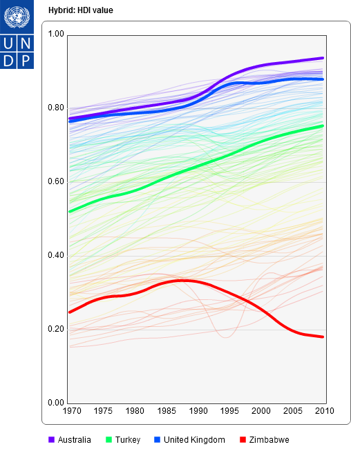
The idea of development being a continual process, or sliding scale, is known as the development continuum and it originates from the realisation that there is no template for development or a right or wrong way to approach it and therefore all countries develop in different ways and at different speeds.  I am not quite sure how well this graph actually links in with the idea of the development continuum but its quite a nice one to look at to see the differing speeds of development and shows how, in terms of development, Asia is starting to catch up with countries like the UK and Japan (http://www.bbc.co.uk/news/world-asia-pacific-13746908)

And, finally, the last topic we discussed was the development gap. The development gap is simply the difference between the most and least developed countries in the world and, again, it is a topic that you need to form your own opinion on. So, is the development gap getting wider or smaller? How can the gap be reduced? Do we, as a developed country, really want it to disappear all together?